


Liche's Liant (2012)
Liche’s Liant was a series of objects that I developed at the invitation of curator David Bennewith for his exhibition Latent Stare, at Casco Office for Art Design and Theory in Rotterdam. Other contributions to the exhibition included Hinrich Sachs, Paul Elliman, Runa Islam, Peter Verheul, Luke Wood, Herman Damen, Karl Nawrot, Jo De Baerdemaeker, Paul Chan, Vasilis Marmatakis, Ji Lee, Christoph Knoth, Frank Adebiaye, Joseph Churchward, and Felix Weigand.
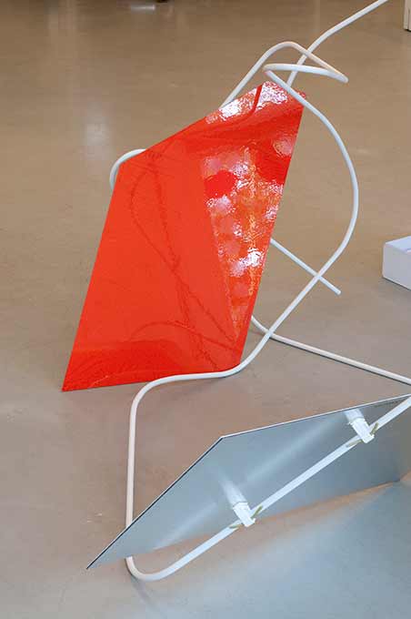
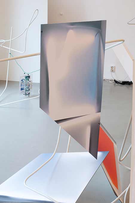
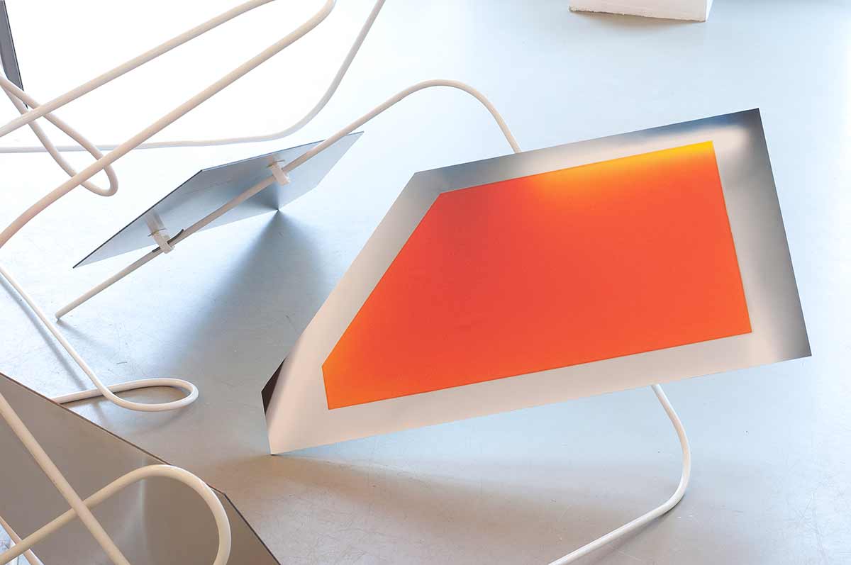
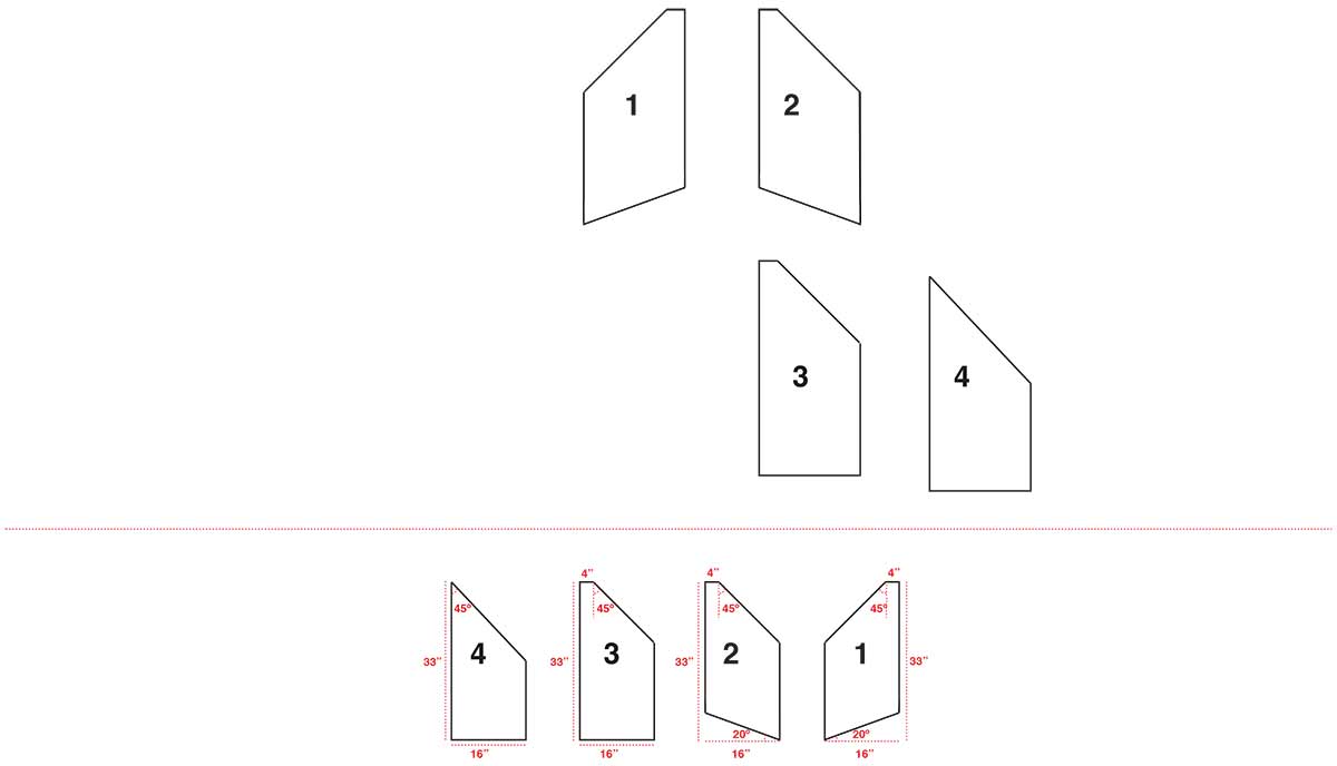
Liche’s Liant consisted of four images printed on dibond that take as their point of departure the Liant typeface, which was developed by Ingrid Liche for the pharmaceutical giant Weleda in the 1976. Liant played an important role in the visual identity of the company as it grew into a prominent global brand after 1976. The relationship of Weleda, a for-profit company, to Steiner’s spiritual philosophy raises questions about the connection of entrepreneurial to spiritual ambitions and the role design plays in bridging the two.
The exhibition text for Latent Stare describes the exhibition as follows:
Latent Stare is an exhibition project that looks at the discipline of type- design through a particular critical lens, assembled by David Bennewith who has been working since 2010 on the subject as an advising researcher of Jan van Eyck Academie…
…The project takes inspiration from the first four volumes of ‘The Journal of Typographic Research’ (1967-1971) that bring together technical, scientific, linguistic, artistic and literature based approaches to and within the type-design discipline. As the journal was conceived at a moment when the type-industry was beginning its transition from hybrid-photographic to digital reproduction systems, Latent Stare sees the typeface now fully-immersed in the digital era of communication and production, while suggesting speculative counterpoints.
The exhibition is organized in a spatial structure designed by artist Olga Balema, who has produced a series of repeated skeletal forms, that appear to maintain both a script and an ideographic sign and which, in turn, connect, support, strangle and separate the works. My contribution is described in a text that I wrote to accompany the piece in the exhibition catalogue:
What happens when spirituality is commodified?
In 1976 Weleda AG hired Austrian designer Ingrid Liche to develop a typeface for the company’s identity and product packaging. Weleda is a German natural cosmetics company founded by Rudolf Steiner and Ita Wegman on the principles of Anthroposophy, Steiner’s philosophy that attempts to integrate spirituality with the scientific study of humans and their relation to nature. Liant, the typeface that Liche developed for Weleda, has been used by the company subsequently to promote its line of natural skin care, baby care and medicinal products. Liant played an important role in the visual identity of the company as it grew into a prominent global brand, as well as the aesthetic of the natural cosmetics industry since 1976.
The relationship of Weleda, a for-profit company, to Steiner’s spiritual philosophy raises intriguing questions about the connection of entrepreneurial to spiritual ambitions, and the role design plays in bridging the two. On the one hand, material existence is rooted in physical objects and processes. Spiritual existence is, in contrast, immaterial. The term spirit is defined precisely in distinction to physical form. Commodifying spirituality, or selling material products that attempt to invoke a spiritual experience, would seem to contradict this basic distinction. We expect a division between spirituality and commerce, and despite the pleasure that my Weleda facial lotion brings, when I apply it I have the uncanny feeling that I have been implicated in a spiritual ideology that is out of step with my normal consumer experience. For Steiner, though, there was no division between spirituality and commerce. By engaging in Gesamtkunstwerk, he was able to bridge between entrepreneurial and spiritual worlds without apparent contradiction, but his dual interest appears to the casual consumer as a conflict of interest.
Analyzing the typographic forms of Liant reveals relations to Steiner’s architecture that are too consistent to be accidental. The chiseled ascenders and taut curves of Liant resonate with the departure from the orthogonal that characterizes the plans and fenestration of the first and second Goetheanums designed by Steiner to house the theatrical events of the Anthroposophical Society. In Steiner’s buildings and Liche’s typeface, right angles give way to curvilinear forms found in nature, the subject of Anthroposophic inquiry. Latent in the sinuous letterforms of Liant are embedded questions about the motivations of its creator. Was Liche a true believer? The typeface is so lovingly rendered that I want to believe that the design arose from a devotion to the Anthroposophic spirituality that it attempts to represent. Or, it simply could have been a designer doing her job to find a visual language to communicate the needs and intentions of her client. Any realist would likely maintain that the latter condition is more common, but I would like to preserve the uneasy yet romantic possibility that a multinational cosmetic company might have had at one time a designer motivated by her love for her client, which was also herself.